
SOOCH.AI
SOOCH.AI
Generative Banking Using AI. (Internship)
Role: UX Design Intern
Timeline: 10 Weeks (Jun-Sep 2024)
Team: Founder - led startup + 2 Design Interns
Tools: Figma

Introduction
Design Question
How might we redesign the platform’s workflow architecture to create a cohesive, scalable system that makes AI-powered financial task generation intuitive and efficient?
My Role & Contributions
During my 10-week internship at SOOCH.AI, I helped redesign a generative AI platform built to streamline complex banking and financial workflows.
The platform allows users to generate structured documents and task flows through AI prompts, customizable templates, or fully manual configuration. However, as new features were rapidly introduced, the product’s navigation, visual consistency, and workflow architecture became fragmented - making it difficult for users to undestad how to move from ideas to execution.
My goal was to improve clarity, scalability, and usability while supporting the founder’s version of an AI-driven financial assistant.
The Problem
As the product expanded, the interface began to feel disjointed:
Multiple workflow entry points lacked cohesion
Navigation hierarchy was unclear
Visual components were inconsistent
Key features were difficult to discover
The growing feature set lacked scalable structure
*This led to user confusion during onboarding and reduced efficiency when creating or managing projects.
As a UX Design Intern at an early-stage startup, I worked directly with the founder to improve usability, visual consistency, and workflow clarity across the platform
Conducted heuristic evaluations to identify usability issues in navigation, hierarchy, and workflow clarity
Designed a scalable design system to establish visual consistency across AI-driven features
Re-architected core user flows for project creation, supporting AI prompts, templates, and custom workflows
Created wireframes and high-fidelity prototypes to communicate design solutions
Collaborated directly with the founder to align design decisions with product vision
Iterated on designs based on internal feedback and evolving feature requirements
Establishing a Design System
Before redesigning core workflows, we identified that inconsistent visual styles and components were contributing to user confusion and slowing development.
To address this, we established a foundational design system that included:
1. Defined typography hierarchy
2. Accessible color palette aligned with brand identity
3. Reusable UI components (buttons, inputs)
4. Standardized iconography
This system created visual consistency across features and enabled faster iteration as the product evolved.

Color Style:
buttons:

Icons:

Prototyping
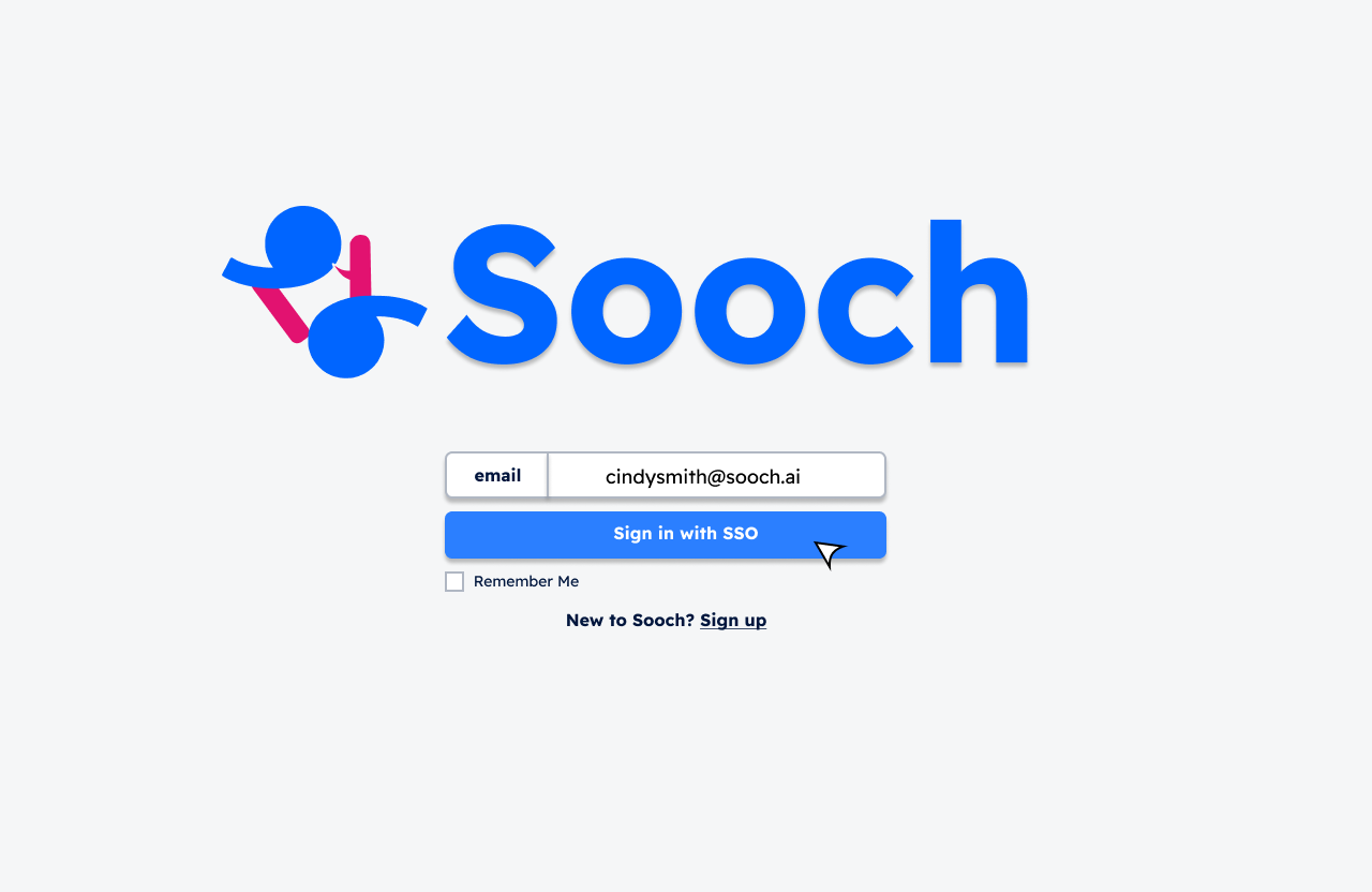
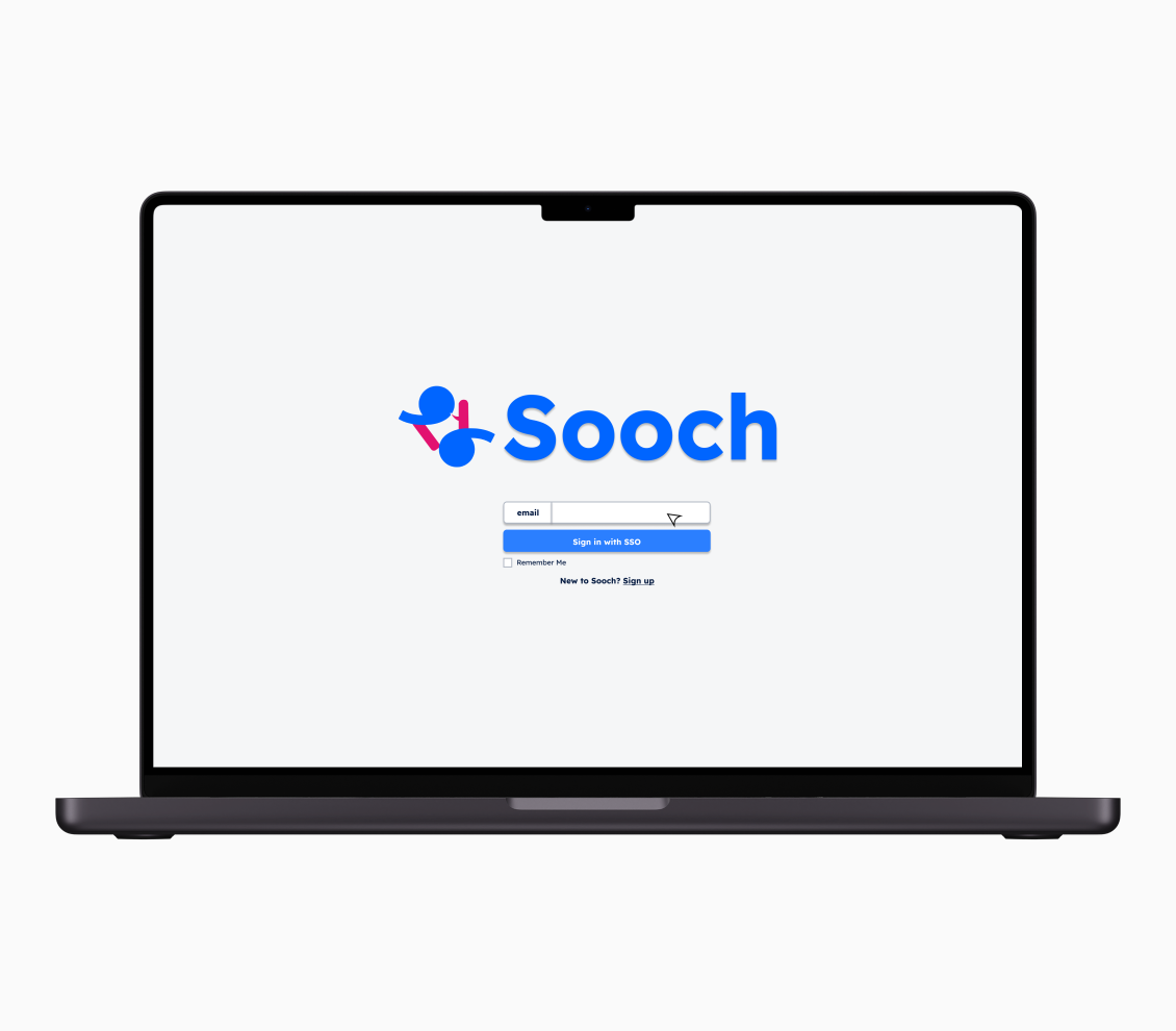
The first two screens displayed here represent the initial experience when opening the SOOCH.AI application. Users are directed to a login page, whether signing in to an existing account or registering a new one. These screens reflect our design system, incorporating blue and pink accents to align with the logo’s colors, while a subtle grey background ensures the imagery stands out without harsh contrasts, creating a clean and visually balanced interface.

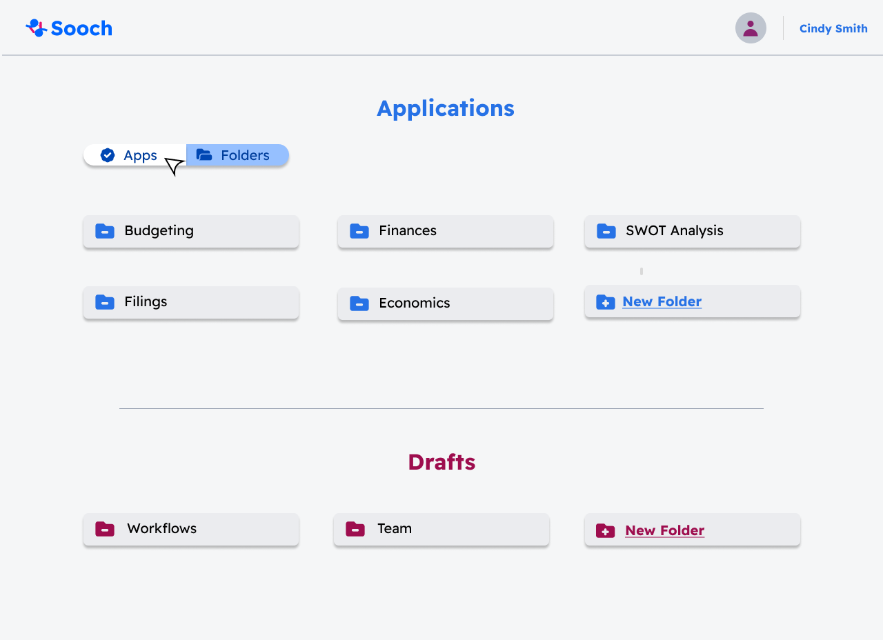
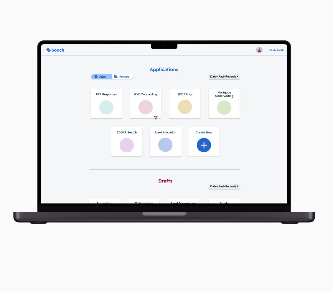
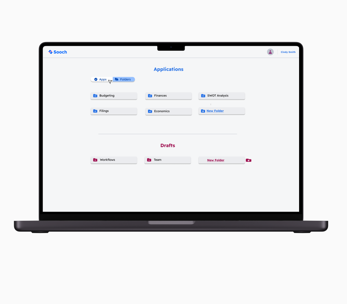
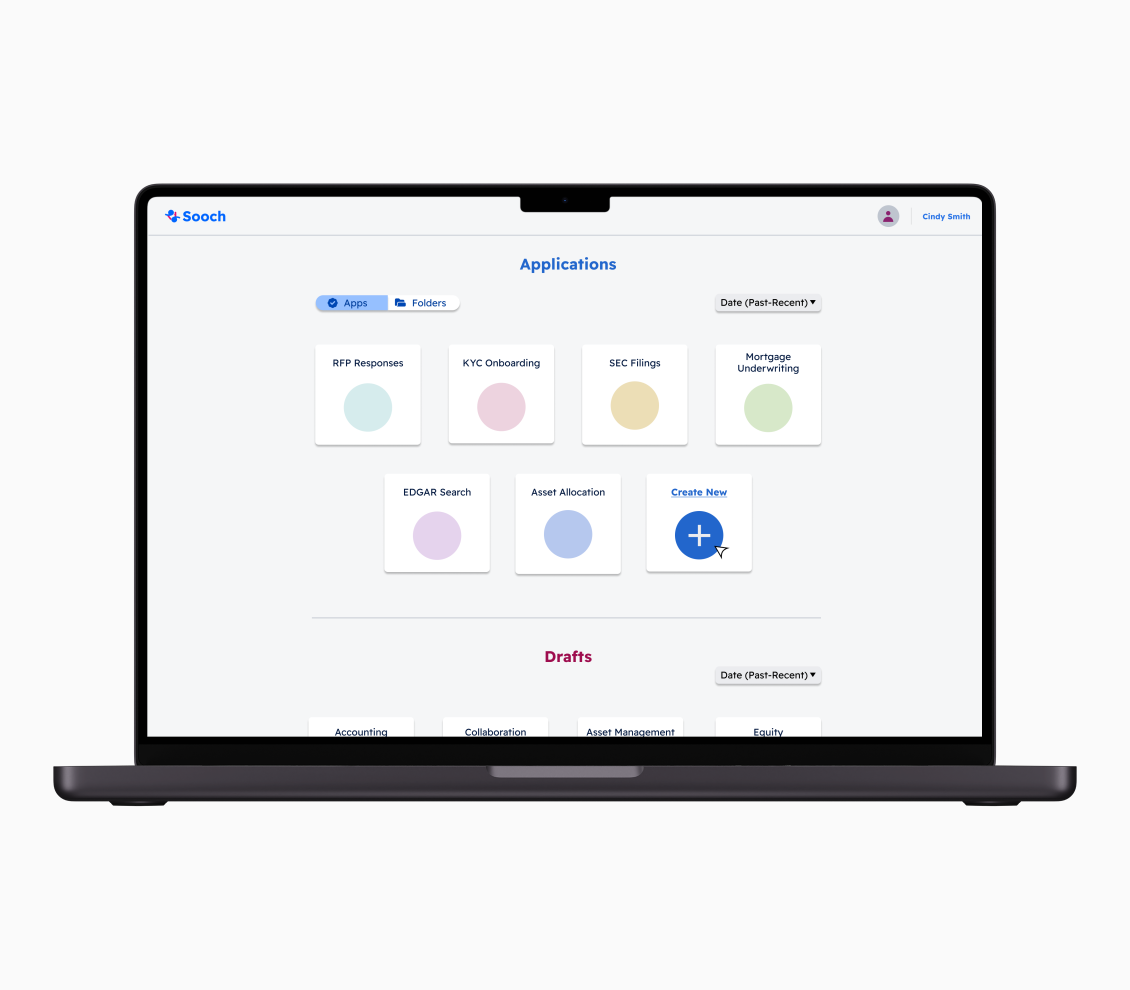
Users can organize and view their applications and drafts within folders for easier management. They can also start a new project directly from the homepage by clicking the plus (+) icon. As shown here, we applied different colors to indicate when a button is selected, using a secondary color from our palette. These color distinctions provide users with a more intuitive experience, clearly signaling their current location and navigation within the application.
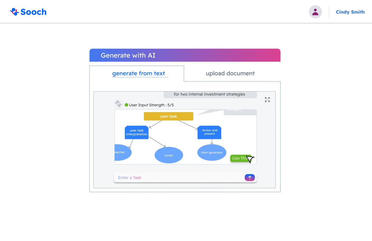
The Generate with AI Prompt feature allows users to create their own workflow by interacting with an AI-powered chatbot for guidance. Users can access this feature in two ways: by selecting it after clicking the "Create New Project" button on the menu, or by adding a new page while working within an existing workflow. This flexibility ensures that users can seamlessly generate workflows whenever they need, enhancing both ease of use and efficiency.

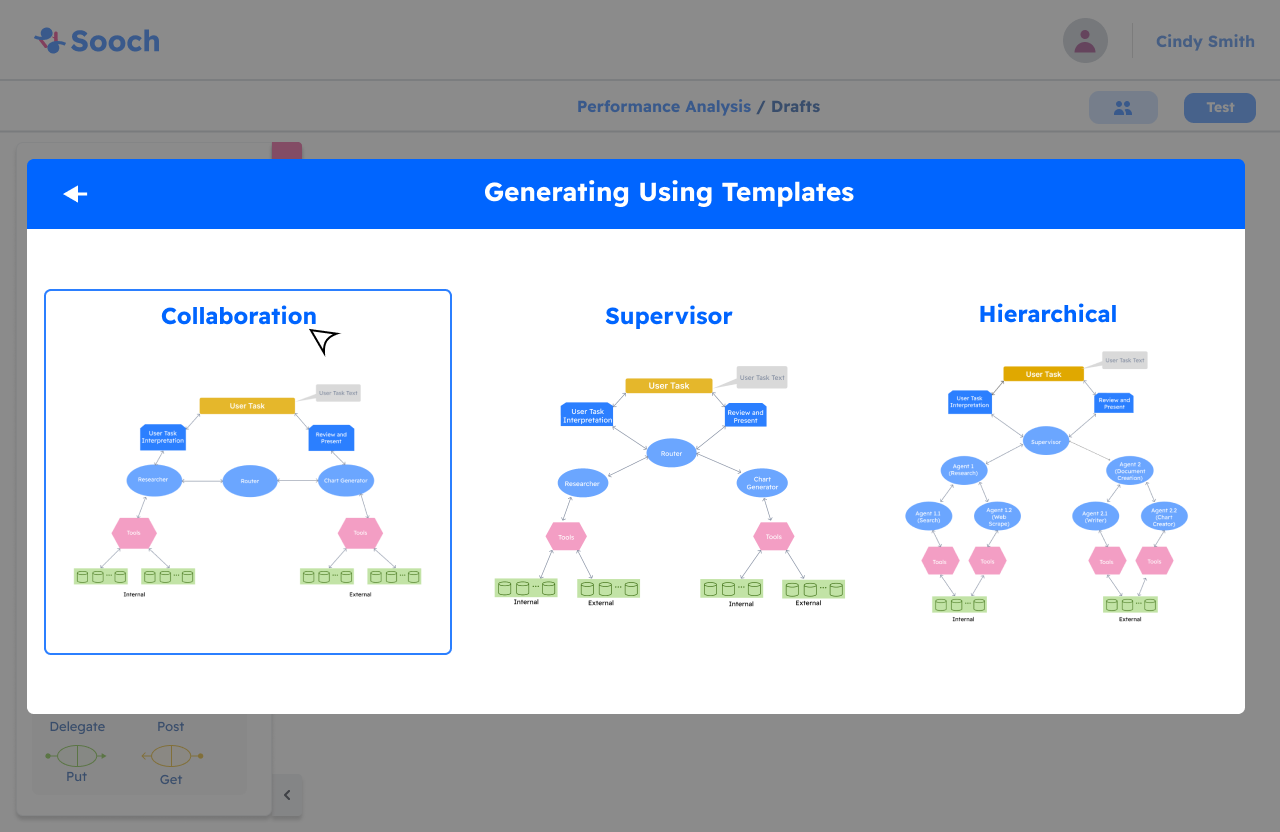
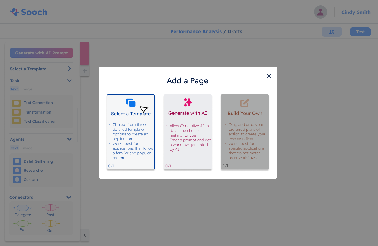
The second way users can create their application is by selecting a template. This can be done either by choosing the Template option from the menu bar or by clicking the plus (+) icon to add a new tab. If the user selects Add a New Tab, it will open the Add a Page popup, presenting three workflow options. Alternatively, selecting Template directly from the menu takes the user straight to the template selection screen, where they can choose between Collaboration, Supervisor, or Hierarchical templates.
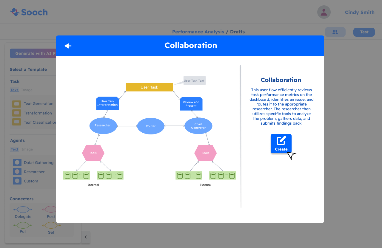
As shown above, the user selects Collaboration as their template. This action takes them to a confirmation page to ensure they want to proceed with the selected template. Once confirmed, the template is automatically added to the workspace, with full flexibility for the user to modify it as needed. After adding the template, the user is prompted to complete additional details for each part of the workflow, including Prompt, Tools, and LLMs, allowing them to further customize the flow.
Testing and launching (Workflow):
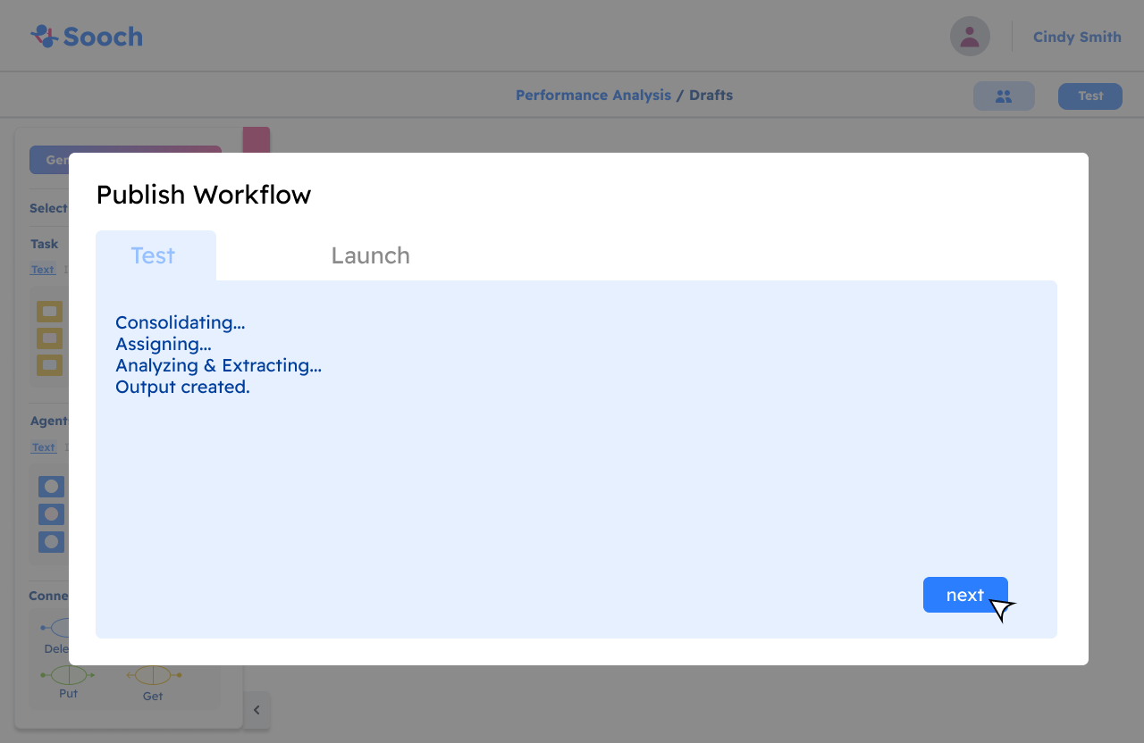
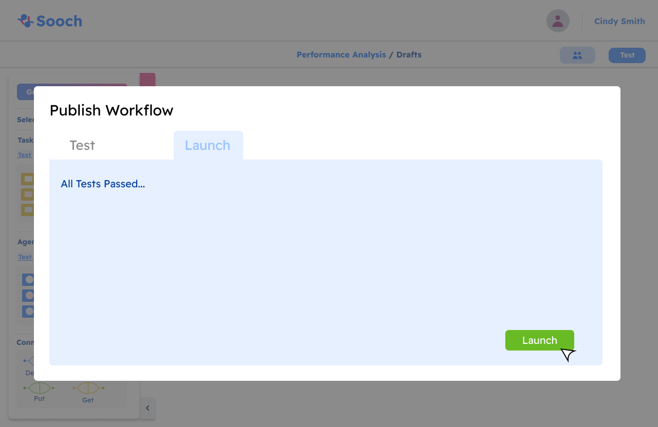
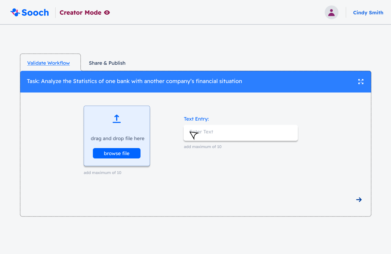
This workflow emphasizes the document creator’s ability to validate the document and manage collaborator permissions for viewing and editing. By enabling these features, the creator can ensure that only authorized individuals have access to the document, fostering a secure and collaborative environment.
Once the validation process is successful and any necessary adjustments to collaborator permissions are made, the finalized document will be readily accessible on the homepage. This allows users to easily locate and manage their projects, ensuring a seamless workflow as they continue to build and refine their applications. By streamlining these processes, we aim to enhance user efficiency and overall experience within the SOOCH.AI application.
Request For Proposal (Workflow):

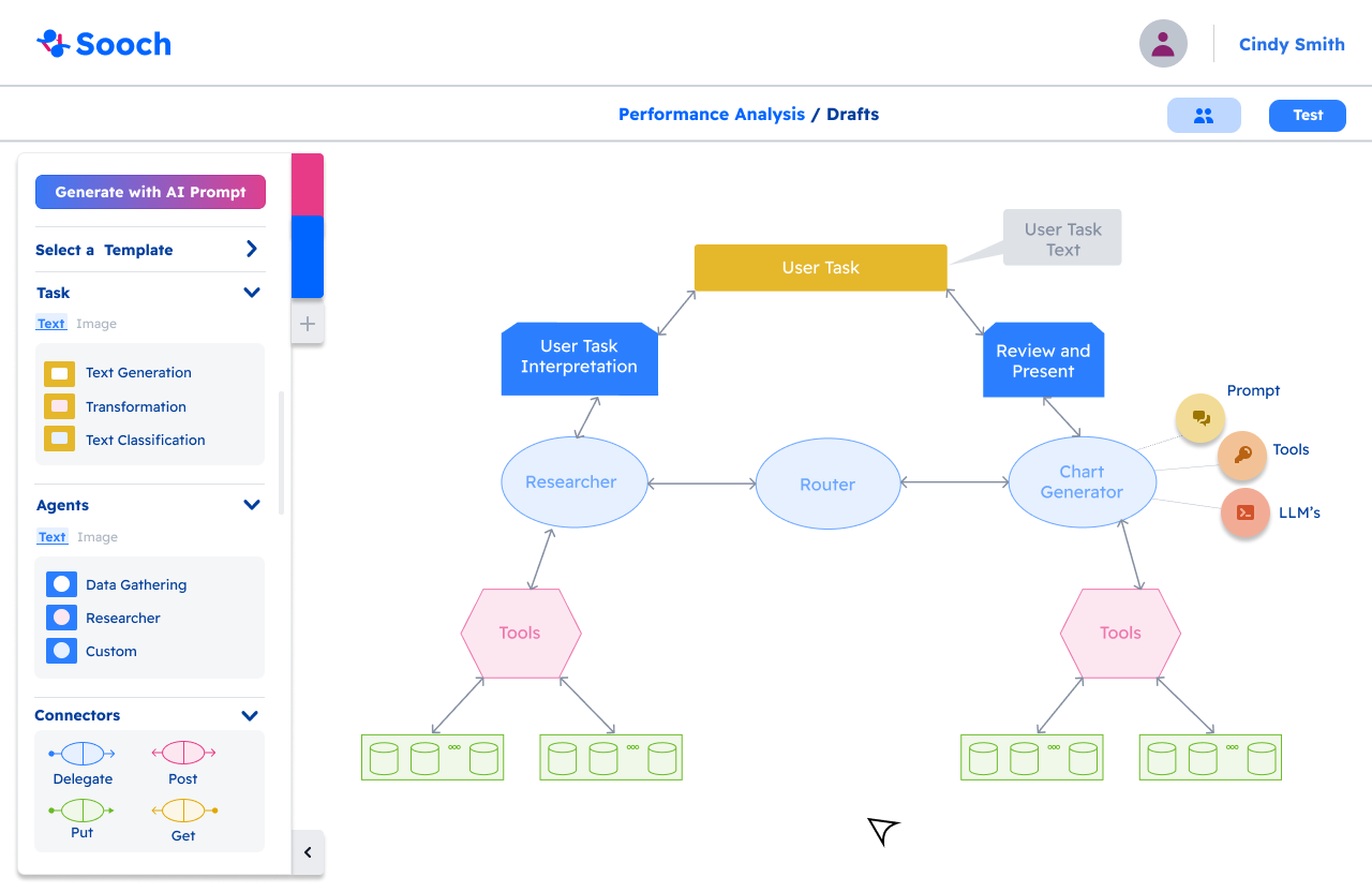

Within the Custom feature, users can further enhance their application by adding detailed information. When the custom section appears, two additional features become available. Since entering details for Prompt, Tools, and LLMs can be overwhelming, our UX team introduced a collapsible information bar on the right side of the screen. This bar appears only when users are working within the Router or Researcher circles, helping maintain a clean and focused interface. For better usability, once all the required information for Prompt, Tools, and LLMs is completed, a green checkmark appears, indicating that the input is correct and successfully processed.
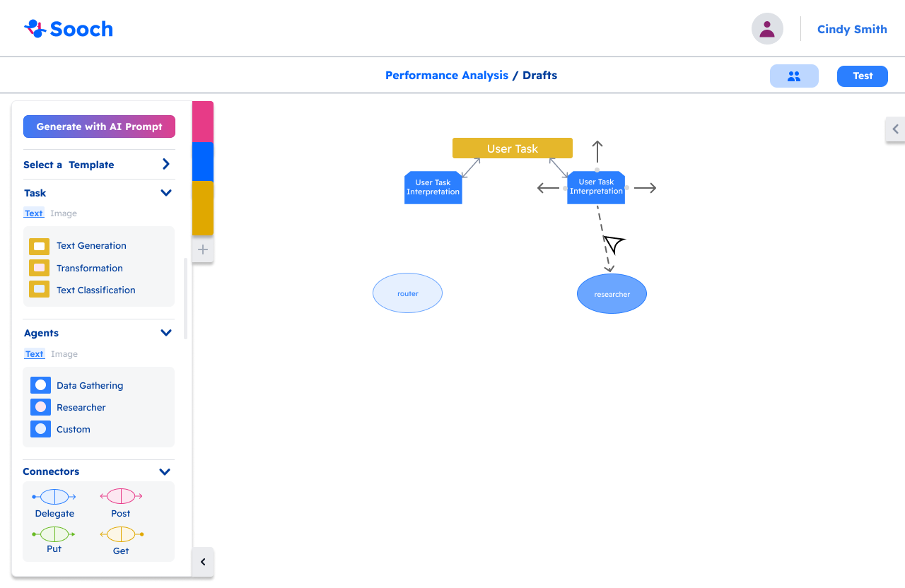
Once the application is complete, the user can proceed to test and launch it. A Test button, located at the top-right corner of the workspace, ensures easy access. Clicking the button opens a testing popup, where the user can initiate the testing process. After testing is complete, the user can validate the application. Once validated, the project becomes accessible on the homepage, appearing alongside previously completed applications.
Validating and publishing (Workflow):
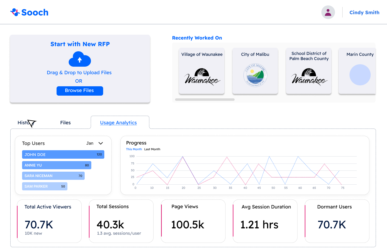
Lastly, the Request for Proposal (RFP) feature enables clients to access analytics related to their RFPs. Our design aims to provide three key functionalities: the Answer Engine, Executive Brief Creator, and Response Creator, all designed to be accessible and intuitive for users.
On the main RFP page, users will find the Add New RFP button on the left side, along with a list of previously added RFPs. The bottom half of the screen focuses on providing insights into the user's history, files, or usage analytics, allowing for comprehensive management and review of their RFP activities
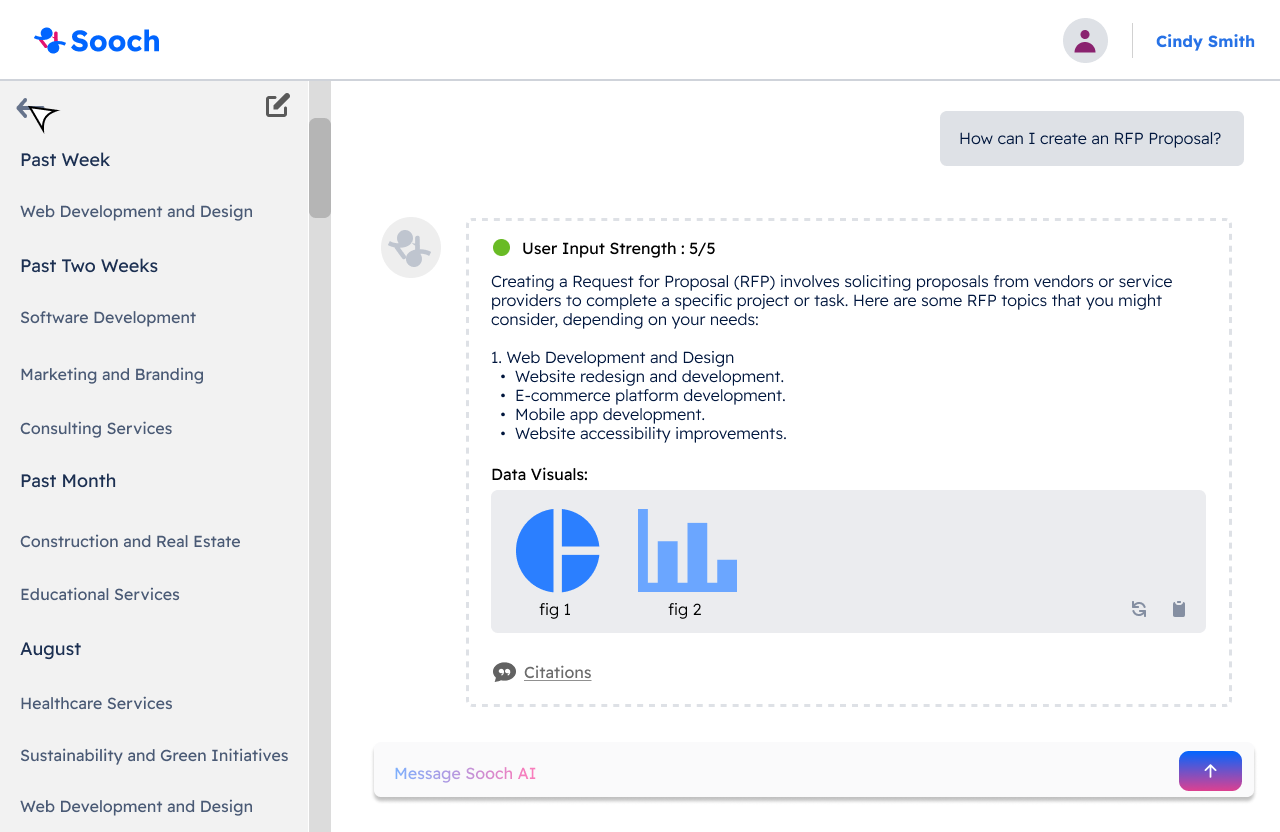
The Answer Engine: The Answer Engine includes a chatbot feature that allows users to ask questions and receive AI-generated responses, assisting them in navigating the RFP process. The design prioritizes clarity and readability, ensuring an intuitive experience for users. The interface displays the history on the left sidebar, while the chatbot occupies the right side of the screen, providing a streamlined layout for easy access and interaction.
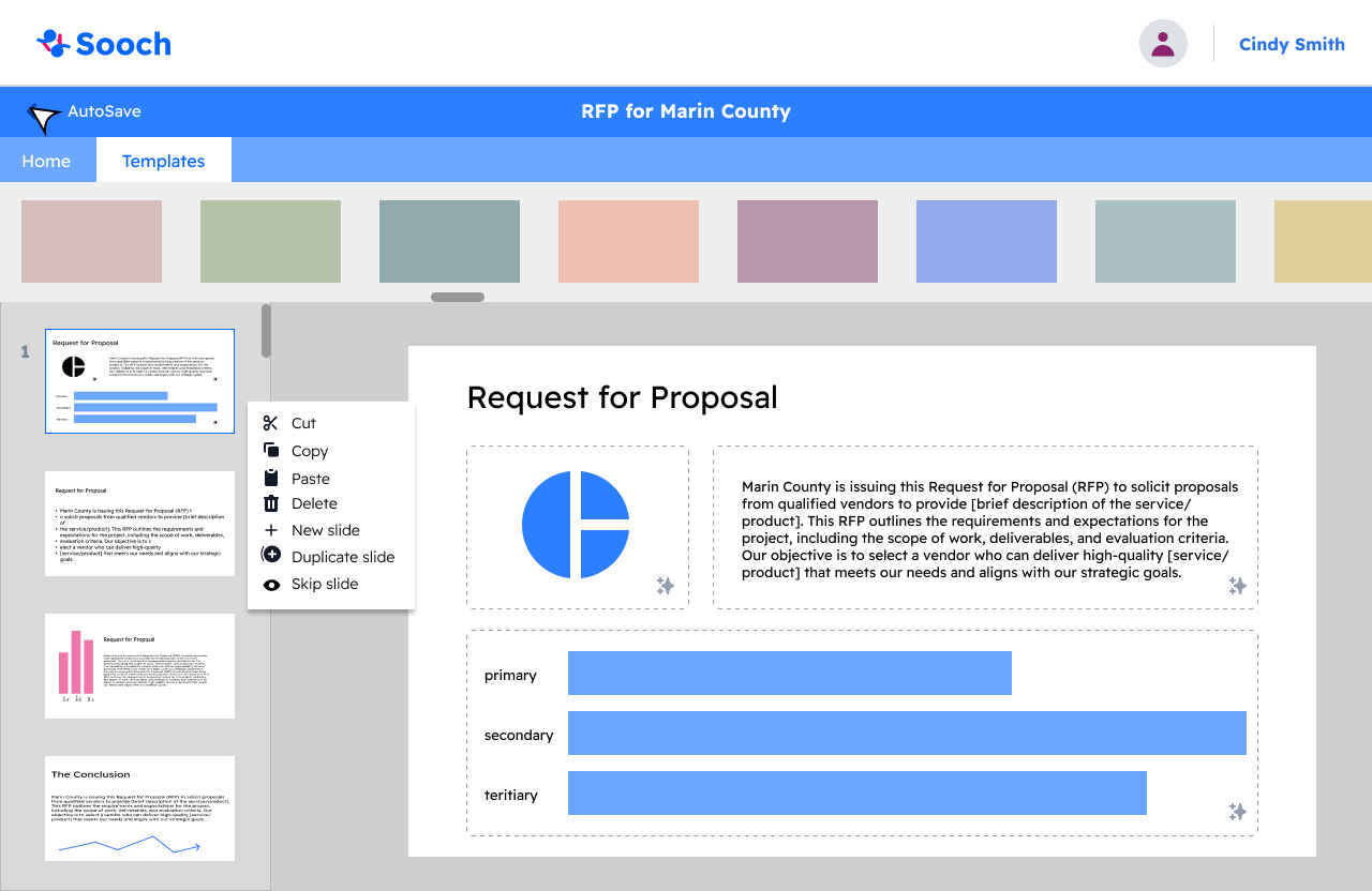
The Executive Brief Creator: This feature is designed to help users edit and modify content while summarizing lengthy information. With this goal in mind, the page layout is optimized for easy navigation, allowing users to quickly find the templates they wish to use. Additionally, it provides straightforward access to edit summaries and other related content, enhancing the overall user experience.


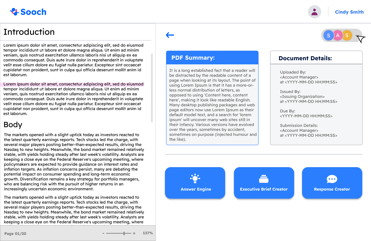
When the user selects a document from their history, they will be directed to a view of that document, where they can access the Answer Engine, Executive Brief Creator, and Response Creator options. Below, I will provide an overview of each feature.

The Executive Brief Creator: This feature is designed to help users edit and modify content while summarizing lengthy information. With this goal in mind, the page layout is optimized for easy navigation, allowing users to quickly find the templates they wish to use. Additionally, it provides straightforward access to edit summaries and other related content, enhancing the overall user experience.
Generate with AI Prompt (workflow):

To access the Add a Page popup, users can click the plus (+) icon in the menu, as shown above. Once in the Generate with AI feature, a chatbot assists users in creating their own workflow by generating suggestions based on input text. After receiving the workflow suggestion, users can either accept it or make adjustments. If satisfied, the AI-generated workflow is added directly to the working page.
Regarding our color palette, we’ve implemented color-coding to help users easily identify their workflow type. Blue represents workflows created using templates, pink indicates those generated with AI, and yellow is used for workflows built from scratch. This visual system enhances navigation and ensures a smoother user experience.
Select A Template (Workflow):
Build your Own (Workflow):
The final method for creating a workflow is by building one from scratch. Users can do this by utilizing the menu to add unique components to the workflow. The menu offers several key options, including Task, Agents, and Actions, which are essential elements that make the application function. In this example, the user begins by selecting Custom from the Agents page. Upon clicking this option, a section labeled “Custom” is added to the workflow, giving the user full control to tailor it to their needs.
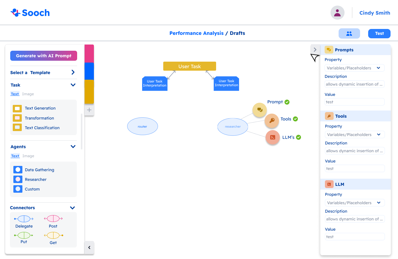
After completing the Prompt, Tools, and LLMs fields, the Researcher circle will turn a darker blue, signaling that the section is complete. The user can then connect the workflow components using a drag-and-drop arrow system. Our team opted for this drag-and-drop interaction to provide a more intuitive and user-friendly experience.
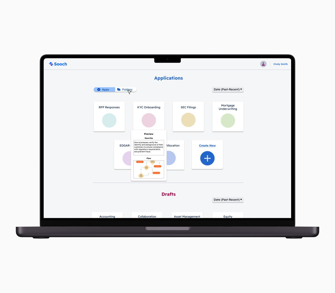
Once logged into the SOOCH.AI application, users are directed to the homepage, where they can view both completed projects and ongoing drafts. To ensure easy navigation, we incorporated icons and maintained the color palette from our design system. Users also have the flexibility to rearrange the order of displayed projects and can hover over a project to see a popup summary of their work.
typography:



With our design system in place, our UX design team began creating high-fidelity prototypes for each of the application's workflows. Below, I’ll walk through each workflow in detail:
home workflow:
Full Design >
My Reflection *
If I were to highlight three key takeaways from my internship, they would be:
Feedback and Improvement: Learning to be patient during the design process can be challenging, especially with multiple iterations. However, staying open-minded and receptive to feedback from my peers and supervisors has significantly enhanced the quality of my work.
Project Management: I gained valuable experience in managing my time effectively alongside my colleagues. I also learned the importance of clear communication to ensure that we remain aligned and on track with our projects.
Technical Skills: My internship provided me with the opportunity to delve deeper into Figma, from understanding design systems to building components. I gained a solid grasp of Figma's structure and functionalities, which has greatly improved my design capabilities.