AeroAccess
Designing an accessible in-flight experience that helps visually impaired travelers navigate flights with greater independence.
Company Boeing
Timeline 6 months (Jan 2025 - Jun 2025)
Role UX Design Intern
Introduction
Boeing challenged our team with a single word: accessibility. Rather than starting with a predefined problem, we explored where visually impaired travelers experienced the greatest barriers throughout air travel. Through interviews and synthesis, we uncovered three key opportunity areas: navigation, flight information, and entertainment. These insights guided the design of AeroAccess, an accessible in-flight companion that helps visually impaired travelers navigate the in-flight experience more independently.
The Challenge
Our biggest challenge wasn't designing an interface; it was defining the problem itself.
At the beginning of the project, we explored accessibility broadly, initially considering emergency evacuations. After interviewing visually impaired travelers and studying airline accessibility practices, we found that the greatest barriers happened throughout the entire in-flight experience, not just during emergencies.
My Contributions
Research
Conducted 5 semi-structured interviews
Synthesized qualitative findings
Design
Designed user flows
Created 15 high-fidelity screens
Collaboration
Weekly design critiques with Boeing
Presented to stakeholders
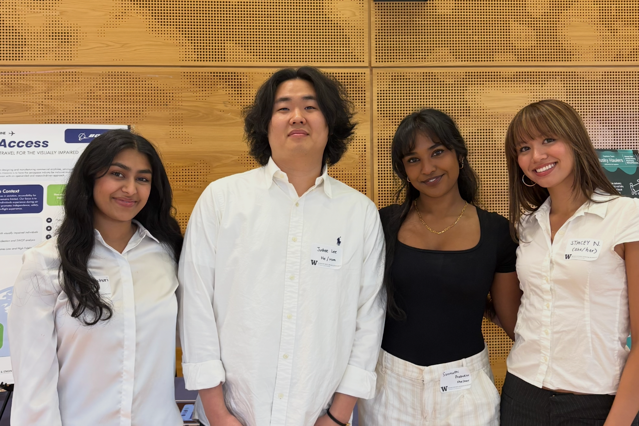
The AeroAccess team presenting at the UW HCDE Showcase.
Before designing a solution, we first needed to understand where visually impaired travelers encountered the greatest barriers throughout the flight.
The Research
Key Insights
🗣️ 5 Semi-Structured Interviews
(40 min each)
🗺️ Journey Mapping & Affinity Mapping
📚 Secondary Accessibility Research
Insight 1: Flying independently creates anxiety.
Participants often mentioned the emotional burden that is involved in navigating flights independently. Many would rely on flight attendants for reassurance because important information and guidance were difficult to access without assistance.
“I would appreciate a one-on-one where flight attendants talk to me and help me out. I feel seen when they speak to me.”
Insight 2: Critical flight information is often inaccessible.
Participants frequently missed important flight information such as announcements, safety instructions, and real-time updates since this was usually communicated visually or verbally without accessible alternatives. This revealed an opportunity to provide flight information in formats that support independent access.
“It is important to communicate things with passengers in a format they understand.”
✈️ In-Flight Information
Provide accessible flight updates.
Insight 3: Entertainment systems exclude screen-reader users.
Although participants regularly used screen readers on their personal devices, they encountered significant barriers when interacting with airline entertainment systems. Accessibility often stopped at the seatback screen, limiting independent access to movies and other onboard content.
“I could never access the movies that the airline offers. I would have to download movies through my phone to play during the flight.”
Design Opportunity
Our research identified three opportunity areas where thoughtful design could have the greatest impact on the in-flight experience.
🧭 Navigation
Enable independent cabin navigation.
Ideation
🎬 Entertainment
Support audio descriptions and screen readers.
How might we empower visually impaired passengers to experience air travel safely, independently, and confidently?
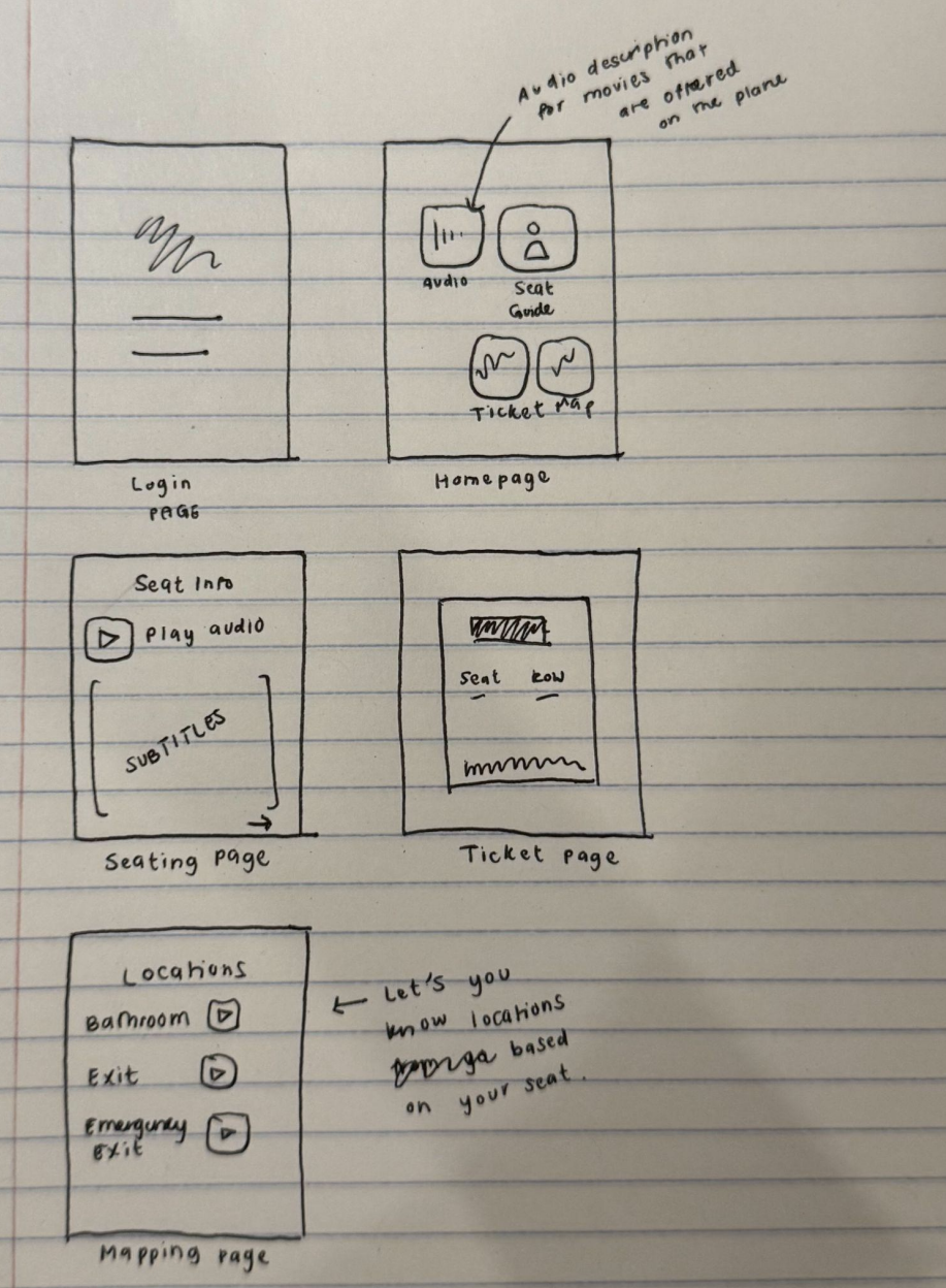
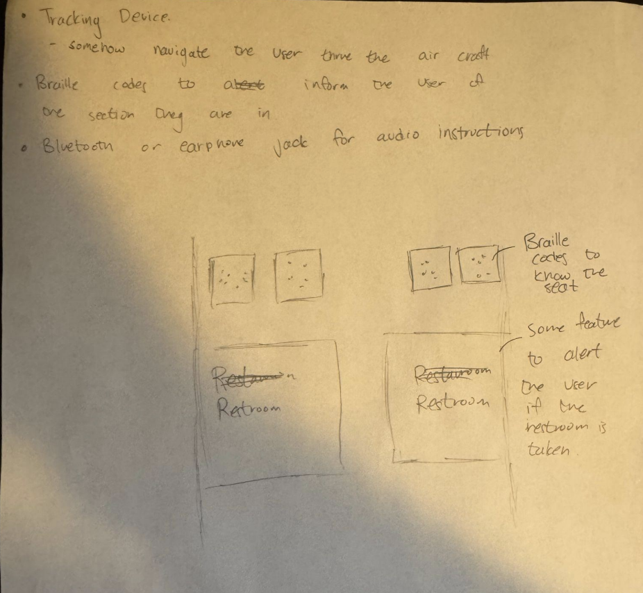
Guided by our research insights, we rapidly explored a variety of concepts through sketching. By generating multiple ideas, we evaluated different approaches before narrowing our direction to the solutions that best supported independent navigation, accessible flight information, and inclusive entertainment.
Selected Concept Sketches
Designed to provide essential flight information in one accessible location.
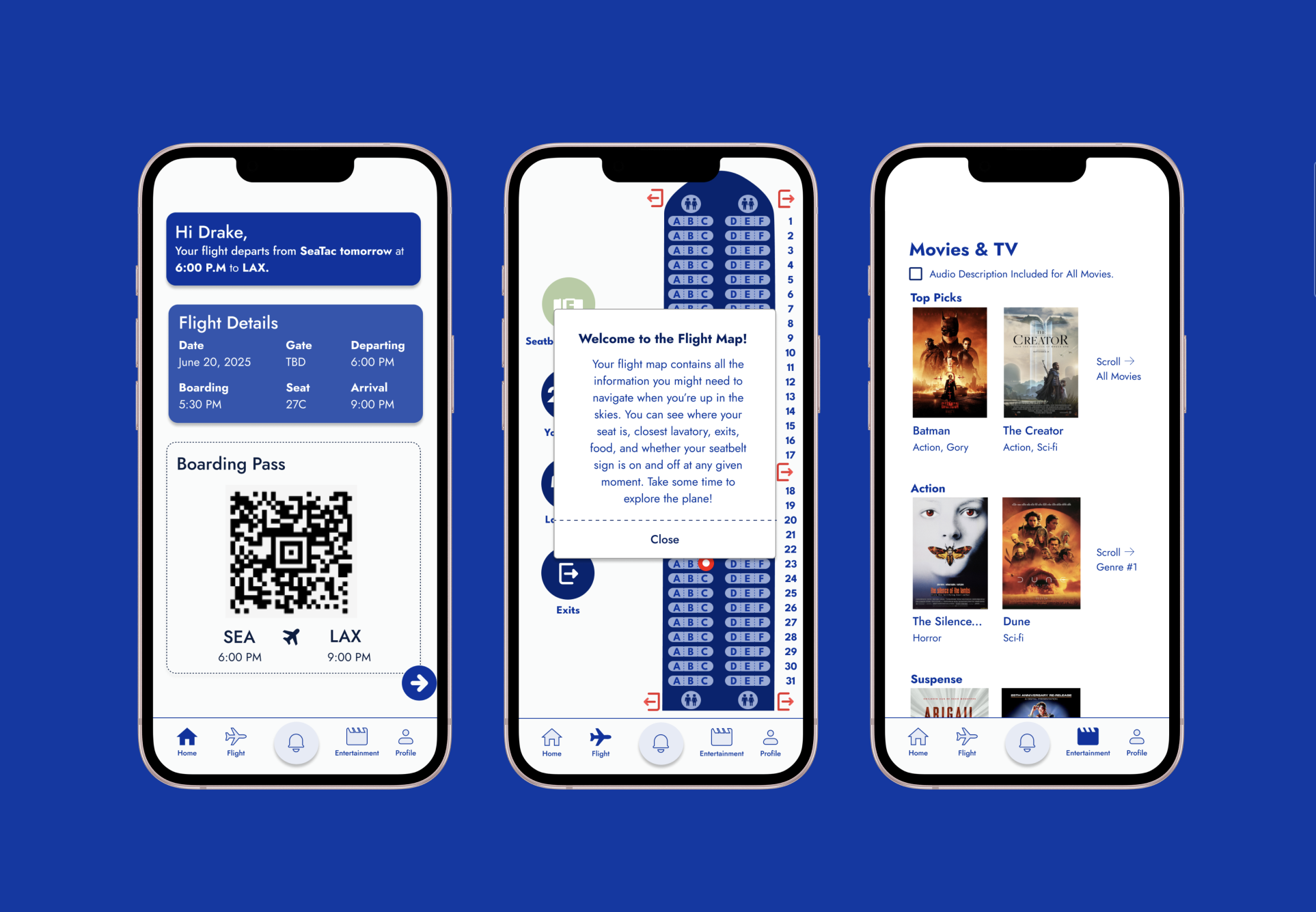
The home screen centralizes essential flight information into one accessible location, allowing passengers to quickly understand their itinerary and flight status. Following Boeing's accessibility standards, the interface prioritizes high color contrast and clear information hierarchy for improved readability.
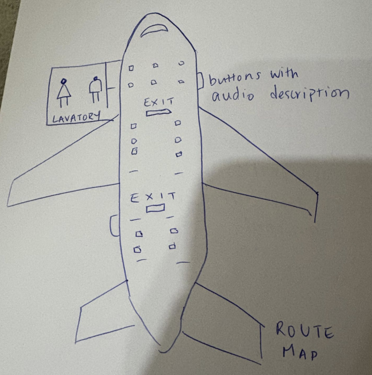
Key concepts explored
Independent cabin navigation
Accessible flight information
Screen-reader compatible entertainment
Flight attendant communication and emergency support
Final Solution
Guided by our research findings and collaboration with Boeing stakeholders, we designed AeroAccess, an accessible in-flight companion that empowers visually impaired passengers to navigate the cabin, access essential flight information, and independently engage with onboard entertainment.
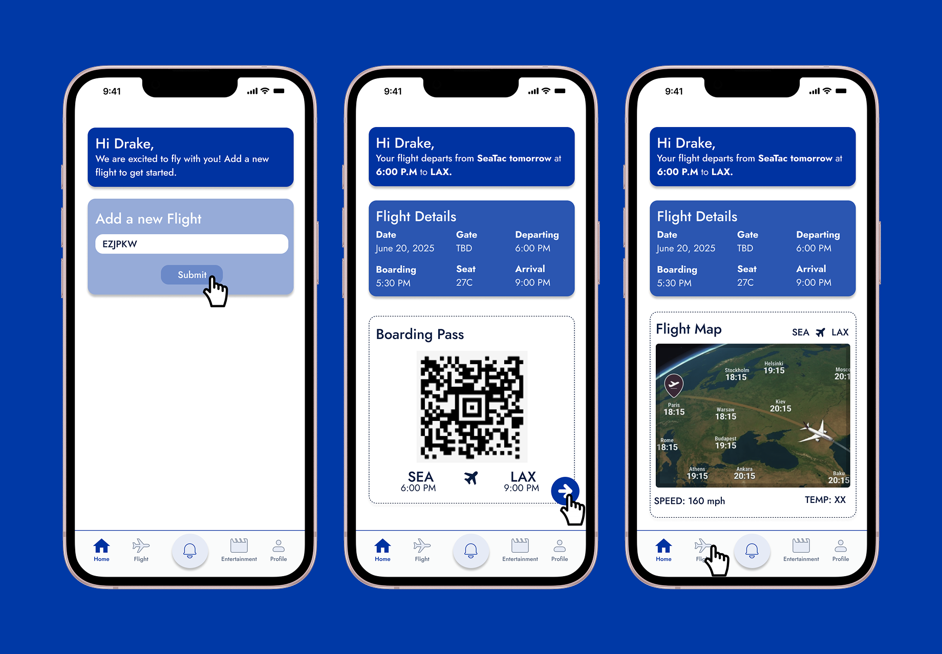
Home & Flight Information
Refining our direction
We selected concepts that best balanced user needs, feasibility, and Boeing's accessibility goals, then refined them into our final prototype.
In-Flight Navigation
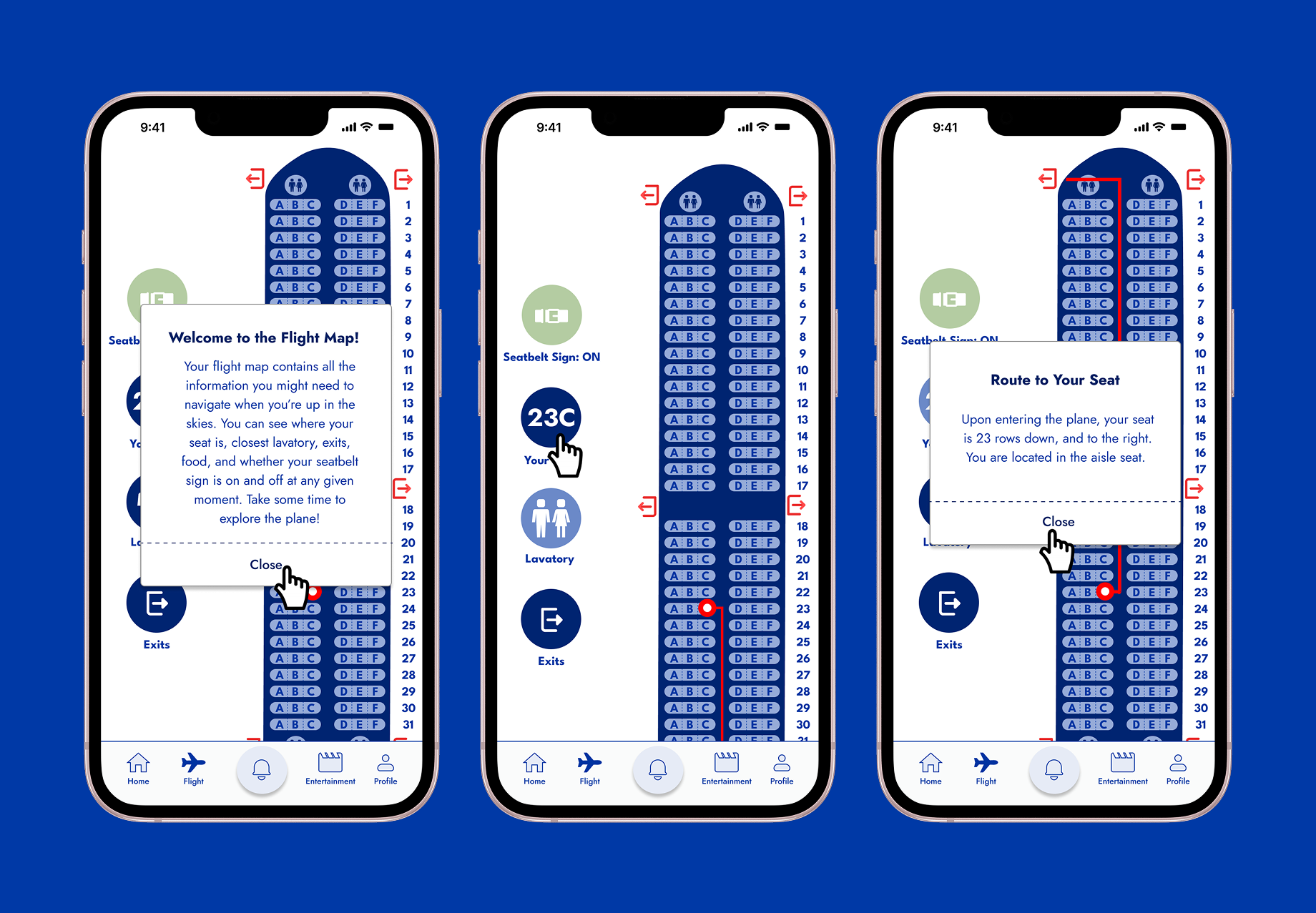
Empowers passengers to navigate the cabin independently.
AeroAccess was designed as a fully screen-reader compatible application, allowing visually impaired passengers to access every feature throughout the experience independently. The in-flight map provides step-by-step guidance to nearby amenities, including restrooms and exits, while real-time seatbelt status and contextual location information help users stay informed as they move throughout the cabin.
We brought our mid-fidelity prototype to Boeing's Customer Experience Center, where we evaluated the experience in a mock aircraft environment. Testing within the cabin helped us identify refinements that improved usability and accessibility before developing our final prototype.
Navigation — Added distance indicators to nearby amenities.
Entertainment — Added the option to enable or disable audio descriptions.
Assistance — Introduced a persistent alert button for quick access to flight attendants.
Reflection
Lesson 1: Embracing ambiguity
At the beginning of this project, I found the open-ended nature of the challenge intimidating. Without a clearly defined problem, it was tempting to start designing immediately. Instead, our team learned to slow down and trust the research process. By listening to visually impaired travelers and synthesizing their experiences, we transformed a broad design challenge into a focused opportunity. This experience reinforced that some of the most impactful design work begins with discovering the problem, not just solving it.
Lesson 2: Accessibility is a system, not a feature
Entering the project, I viewed accessibility as a collection of individual accommodations. Throughout the design process, I came to understand that meaningful accessibility requires designing every interaction with inclusion in mind. This perspective influenced our decision to create a fully screen-reader-compatible application instead of treating accessibility as an isolated feature.
Looking Ahead
Beyond AeroAccess, this project highlighted a broader opportunity for the aviation industry. Throughout our research, we observed that visually impaired travelers often encounter inconsistent interaction patterns across airline applications and onboard systems. Looking ahead, I believe establishing shared accessibility standards for digital airline experiences could create a more intuitive and independent travel experience regardless of airline.
Entertainment
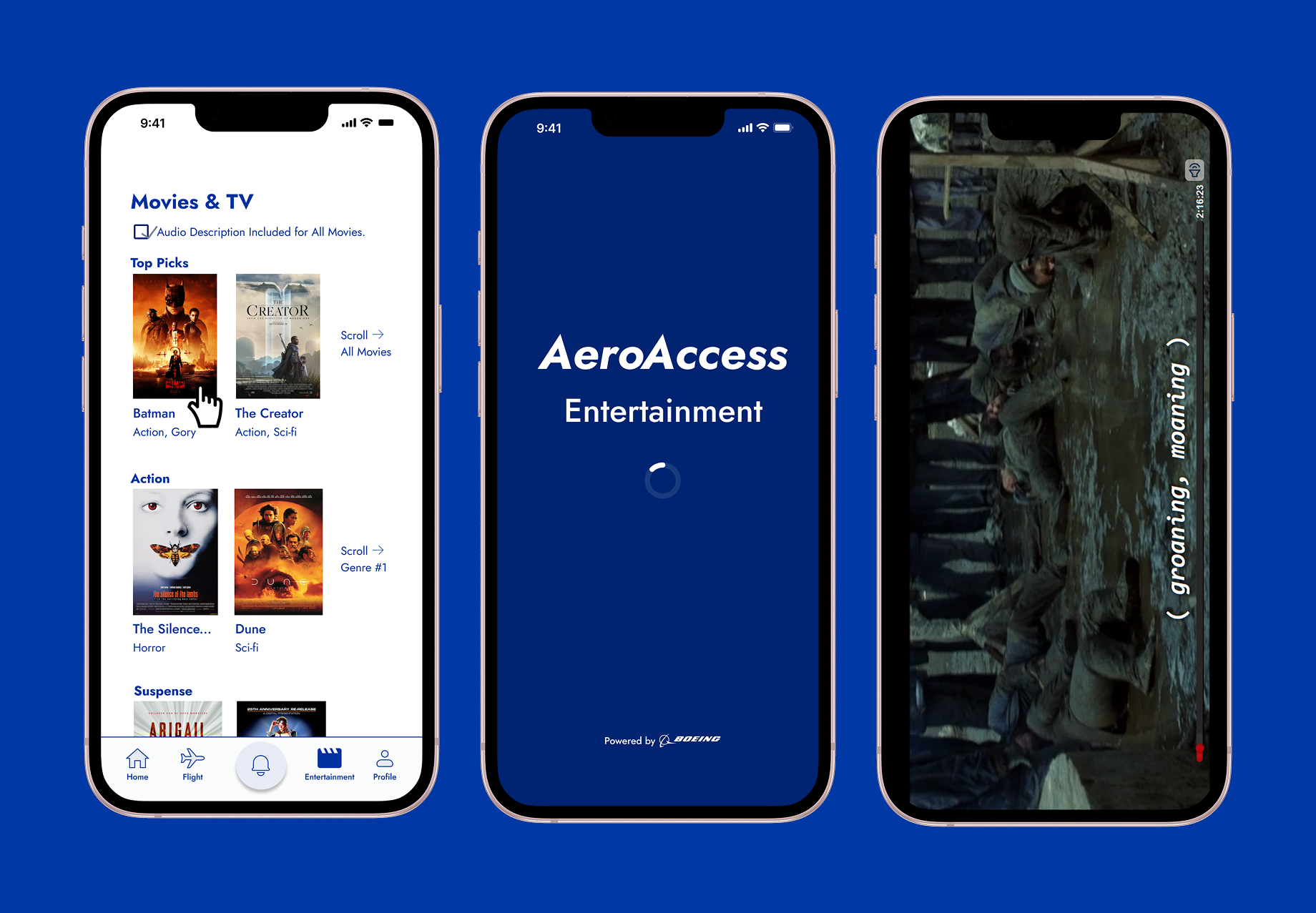
Creates a more inclusive entertainment experience through accessibility features.
Beyond the app's screen-reader compatible foundation, the entertainment experience introduces optional audio descriptions, allowing passengers to personalize how they engage with onboard content while creating a more inclusive viewing experience.
User Testing & Iteration
Key improvements after testing